Choosing the right wedding colors sets the tone for your entire day. Learn how color psychology can help you create a cohesive, meaningful, and visually stunning event.
Color is one of the first things guests notice when they walk into a wedding or event space—often without even realizing it. Before they take in the details, before they sit down, before the ceremony begins, the colors have already set the mood.
That’s the power of color psychology.
If you’ve ever felt overwhelmed trying to choose a wedding palette, you’re not alone. With endless inspiration online and so many trends to choose from, it’s easy to get stuck. The good news? When you understand how color works emotionally and visually, the process becomes much simpler—and a lot more intentional.
Color does more than make your wedding look “pretty.” It shapes the entire experience.
Soft, neutral tones can create a calm and romantic atmosphere. Bold, saturated colors bring energy and excitement. Dark, rich hues feel dramatic and formal. Light, airy palettes feel fresh and relaxed.
When your colors are chosen with intention, everything—from florals to linens to lighting—works together naturally. Instead of feeling pieced together, your event feels cohesive and thoughtfully designed.
You don’t need to be a designer to use color well. A simple understanding of what different colors communicate can go a long way.
Warm tones like red, orange, and yellow tend to feel energetic, inviting, and lively. These colors are great for couples who want a fun, vibrant celebration.
Cool tones like blue, green, and lavender create a more calming and relaxed environment. They’re perfect for elegant, serene, or outdoor-inspired weddings.
Neutrals like white, ivory, beige, gray, and soft blush act as a foundation. They balance bolder colors and help create a timeless look.
Dark tones like navy, emerald, burgundy, and black add depth and sophistication. These are often used in more formal or evening events.
The key isn’t picking just one “type”—it’s learning how to combine them in a way that feels right for your day.
Before you choose a single color, ask yourself this:
How do I want my wedding to feel?
Romantic and soft?
Modern and minimal?
Fun and colorful?
Elegant and dramatic?
Your answer will guide your palette more than any trend ever will.
For example, a romantic wedding might lean toward soft pinks, creams, and muted greens. A modern event might focus on black, white, and metallic accents. A playful celebration might incorporate brighter, unexpected color combinations.
When you start with feeling instead of colors, your decisions become much easier.
Your venue already has a color story—whether you realize it or not.
Look at the walls, flooring, natural light, and surrounding environment. Are there warm wood tones? Bright white spaces? Green outdoor landscapes?
Instead of fighting against those elements, work with them.
A neutral venue gives you more flexibility to bring in bold colors. A space with strong existing tones may benefit from a more complementary palette.
When your colors align with your space, everything feels more seamless and elevated.
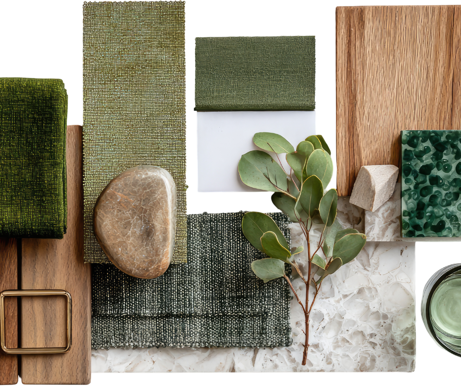
A well-designed palette usually includes more than one or two colors. Instead, think in layers:
For example:
This layered approach prevents your design from feeling flat or overwhelming.
Trends can be fun and inspiring, but they shouldn’t dictate your entire wedding design.
Colors that are popular right now—like terracotta, champagne, or muted pastels—can absolutely be incorporated. But the goal is to adapt them to your personal style, not copy them exactly.
A wedding that reflects you will always feel more timeless than one that follows every current trend.
Your color palette isn’t just for flowers and table settings—it touches almost every part of your day.
Consider how your colors show up in:
When these elements align, your wedding feels cohesive without needing to be over-designed.
Colors can look very different in real life than they do on a screen.
Before finalizing your palette:
This step helps you avoid surprises and ensures everything works together the way you expect.
One of the biggest mistakes couples make is trying to include too many colors.
More isn’t always better.
A focused palette—done well—will always look more polished than one that feels scattered. If you’re unsure, simplify. Narrow your choices and let a few colors shine.
At the end of the day, your wedding colors should feel like an extension of you—not a checklist of what’s trending or expected.
When you choose colors based on emotion, environment, and intention, everything else starts to fall into place. Your décor feels cohesive. Your space feels inviting. Your guests feel the atmosphere you’ve created.
And that’s what truly makes a wedding memorable.
